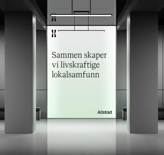
Visual identity
Introduction
To build a strong and lasting brand, it is essential that Allstad appears unified and consistent across all communication platforms. A unified identity contributes to recognition, trust and credibility. Below you will find a comprehensive overview of how Allstad's visual identity is to be implemented and used. We have developed guidelines for the use of the logo, typography, colour palette, imagery and layout principles. These guidelines show how you should present Allstad in both digital and printed formats, and ensure that the brand is always perceived in the same way, regardless of platform.
We encourage everyone to familiarise themselves with these guidelines and apply them to all communication materials. Together, we can ensure that Allstad continues to grow as a strong and recognisable brand.
Concept
Allstad's new identity is based on the concept of "the meeting point", which symbolises the connections between the past and the future, the countryside and the city, the historic and the modern, traditional and innovative, formal and informal, preserved and newly developed, as well as national and local, governmental and commercial. This meeting point is clearly expressed in all of Allstad's visual elements, including the logo, typography, colour palette, imagery and layout.
Allstad's visual identity
Primary logo
Allstad's logo consists of a wordmark with two distinctive l's symbolising the meeting point. This logo is Allstad's primary identifier and should generally be used on all surfaces where Allstad is the sender. The logo is available in black and white, with black being the primary colour used.
Download Allstad's logo in various formats. 
Logo symbol
Allstad's logo symbol consists of the two distinctive L's in isolation. As a general rule, the logo symbol should not be used on its own, but always in conjunction with the logo. The exception is when the symbol is used as a visual element; in such cases, it is not necessary to include the logo. For more information about how the symbol should be positioned in relation to the logo, see the section on logo placement. The symbol is available in both black and white.
Download Allstad's logo symbol in various formats.
Spacing and size
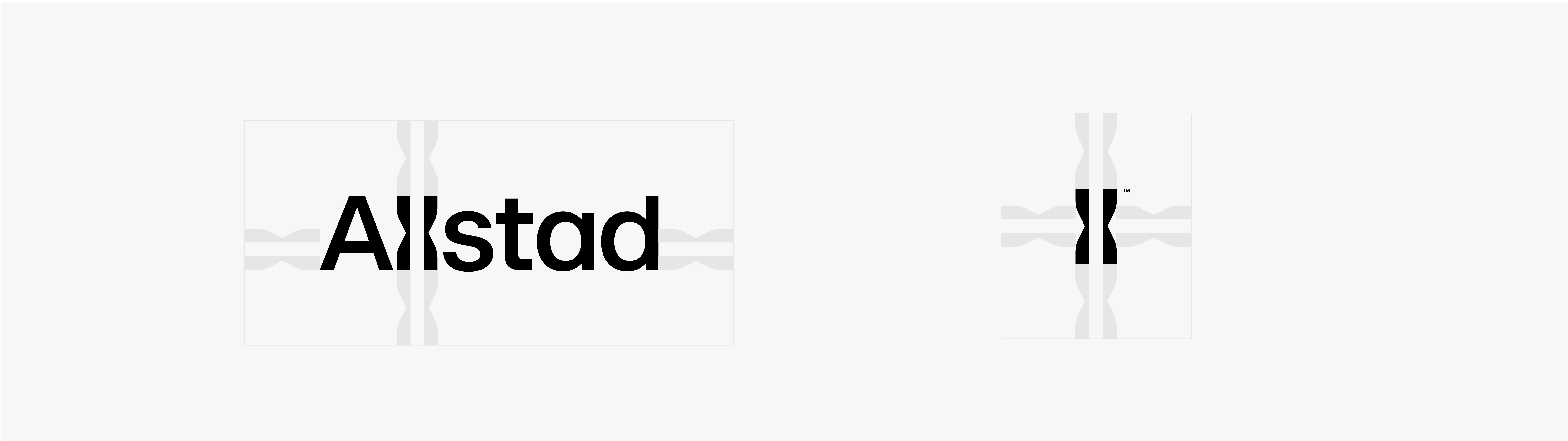
Rules have been established for the spacing between the logo and logo symbol and other elements. This spacing corresponds to the size of the l's, both horizontally on the sides and vertically at the top and bottom. This ensures that the logo has sufficient space and is not disrupted by other design elements. Exceptions apply when the logo or symbol is used as a visual element, for example on promotional products.
Logo placement
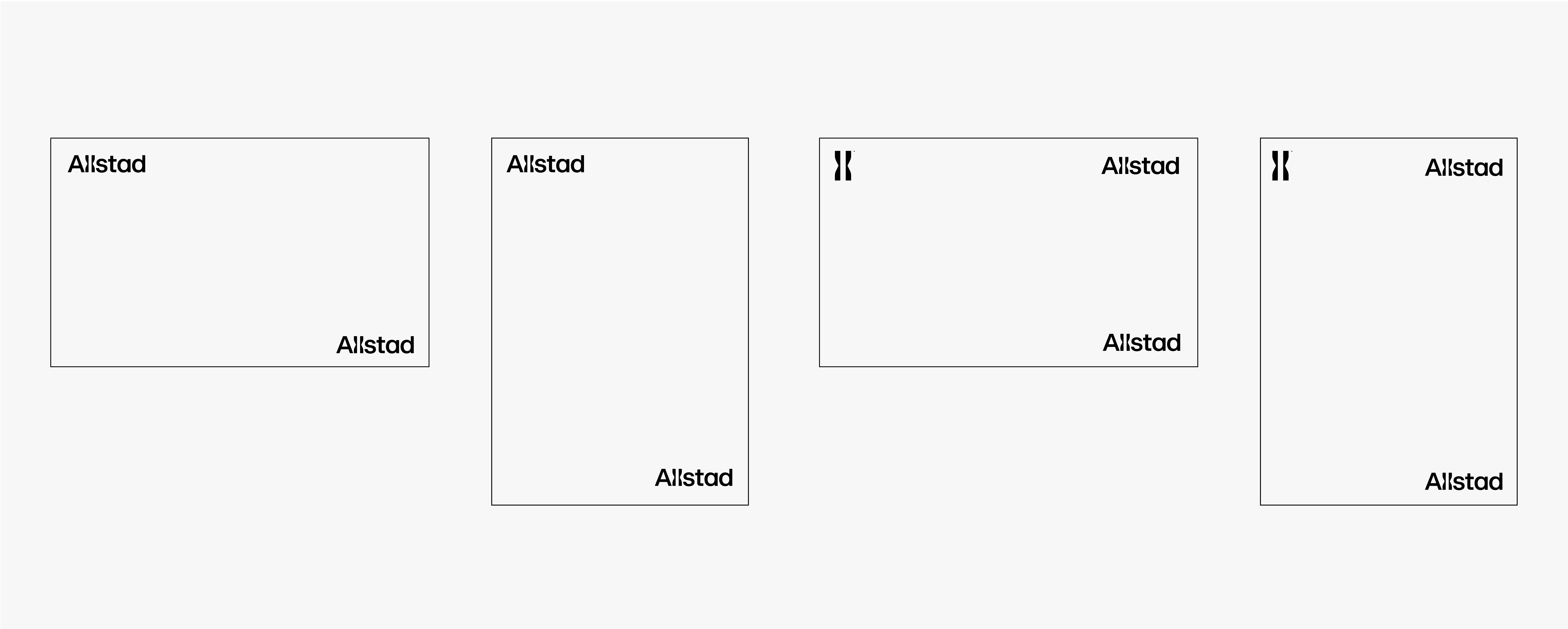
Guidelines have been established for the placement of the logo and logo symbol.
When the logo appears alone, it should be placed either in the upper-left corner or the lower-right corner.
When both the logo and logo symbol are present on the same surface, the logo symbol should always be placed in the upper-left, while the logo should be placed either in the upper-right or lower-right.
Minimum size
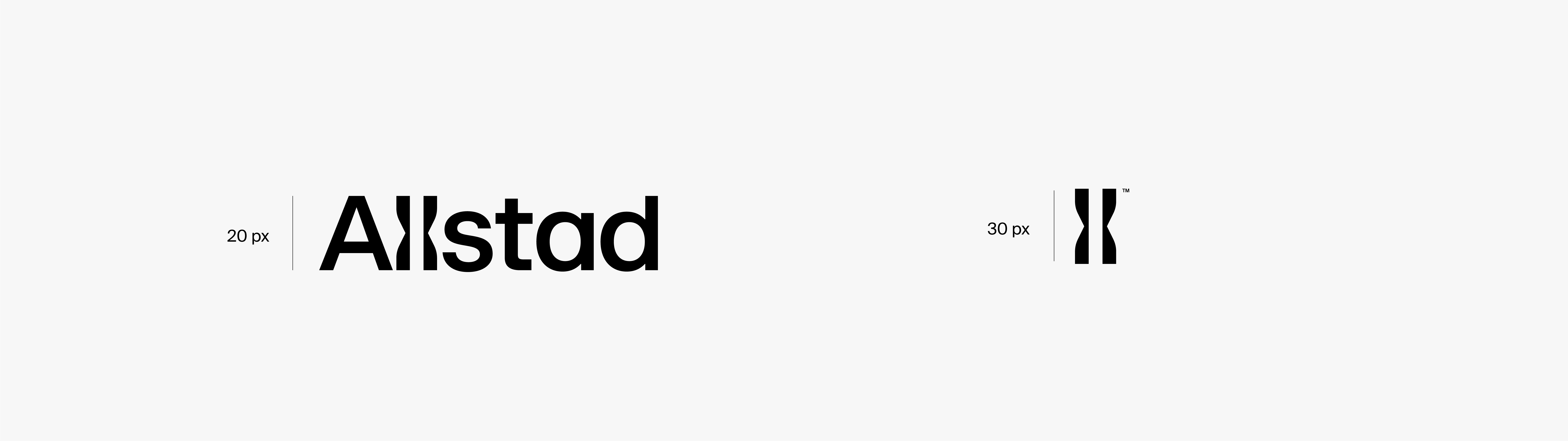
A minimum size has been established for both the logo and logo symbol. The logo should never be smaller than this size. The minimum height for the logo is 20 pixels (px), while the logo symbol should have a minimum height of 30 px.
Size ratio
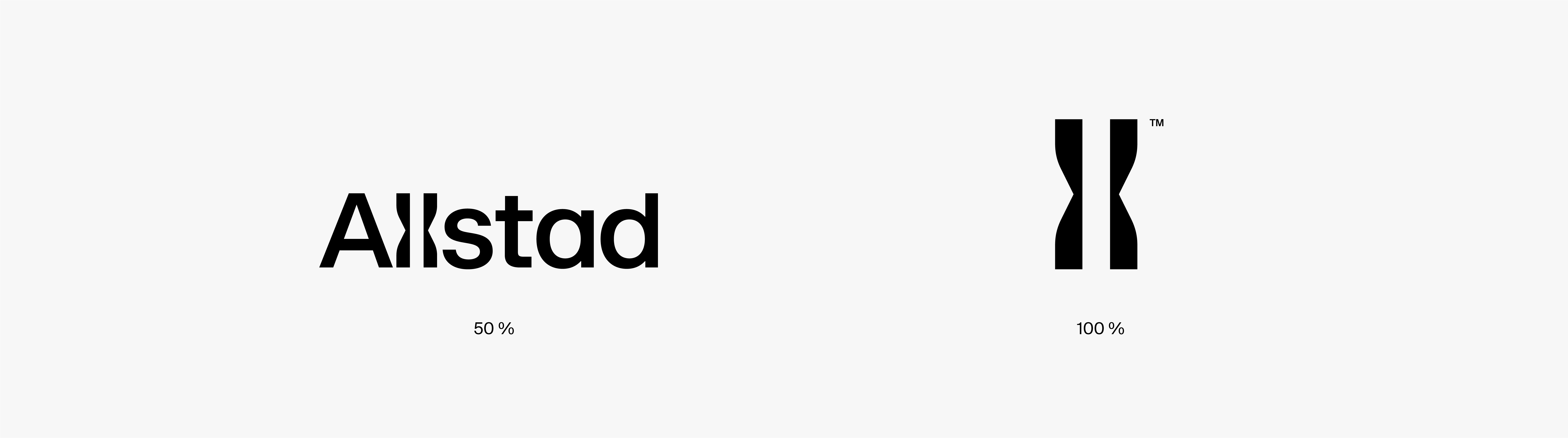
Rules have been established for the size ratio between the logo and logo symbol when they are used together on a surface. The logo symbol should always be 50% taller than the logo.
Typography
A font functions as the tone of voice of the text and plays an important role in conveying its message. It helps create a recognisable visual identity and strengthens the personality of the brand. For Allstad, we have developed a unique typographic voice: Allstad Serif, which, together with the body text font Suisse Int’l, creates a dynamic balance between the past and the future.
Allstad Serif
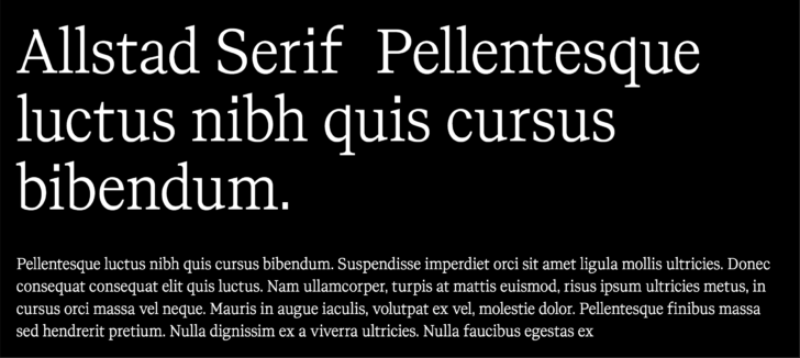
Allstad Serif is Allstad's primary font and is used for headings and introductory text. It should not be used for body text, but can add visual interest to small text components such as page numbers and Calls to Action (CTA). The font is inspired by the concept of “the past meets the future” and combines classical elements with modern details. This combination gives Allstad Serif a unique character that is both friendly and authoritative, strengthening the message in our communication. The narrowing on the left side of the uppercase letters creates a visual connection to our logo and gives titles a recognisable character. This narrowing is intended only for use in titles and should not be used in introductory text.
Download Allstad Serif in OpenType format.
Suisse Int´l
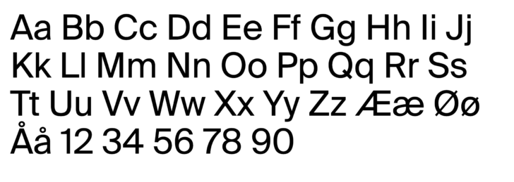
Suisse Int'l is Allstad's body text font and is used for all body text. It is important to note that the font should not be used for headings or introductory text.
Suisse Int'l is a modern Swiss grotesque characterised by its elegant and functional letterforms. This font is incredibly versatile and can be used in a wide range of applications, both in print and on screen. It is particularly well suited as a body font, even at small sizes, making it an ideal choice for long-form reading. With its clean design, Suisse Int'l helps create a comfortable and easy-to-read experience while maintaining a modern aesthetic.
Suisse Int´l is a font from Suisse Typefaces and can be purchased here.
Replacement font for body text
When Suisse Int´l is not available, the replacement font for Allstad's body text is Arial Regular. It is used in the Microsoft Office suite, such as PowerPoint, Excel and Word.
Colours
Allstad's primary colours are black, white and light green, with a darker green added to provide contrast where necessary.
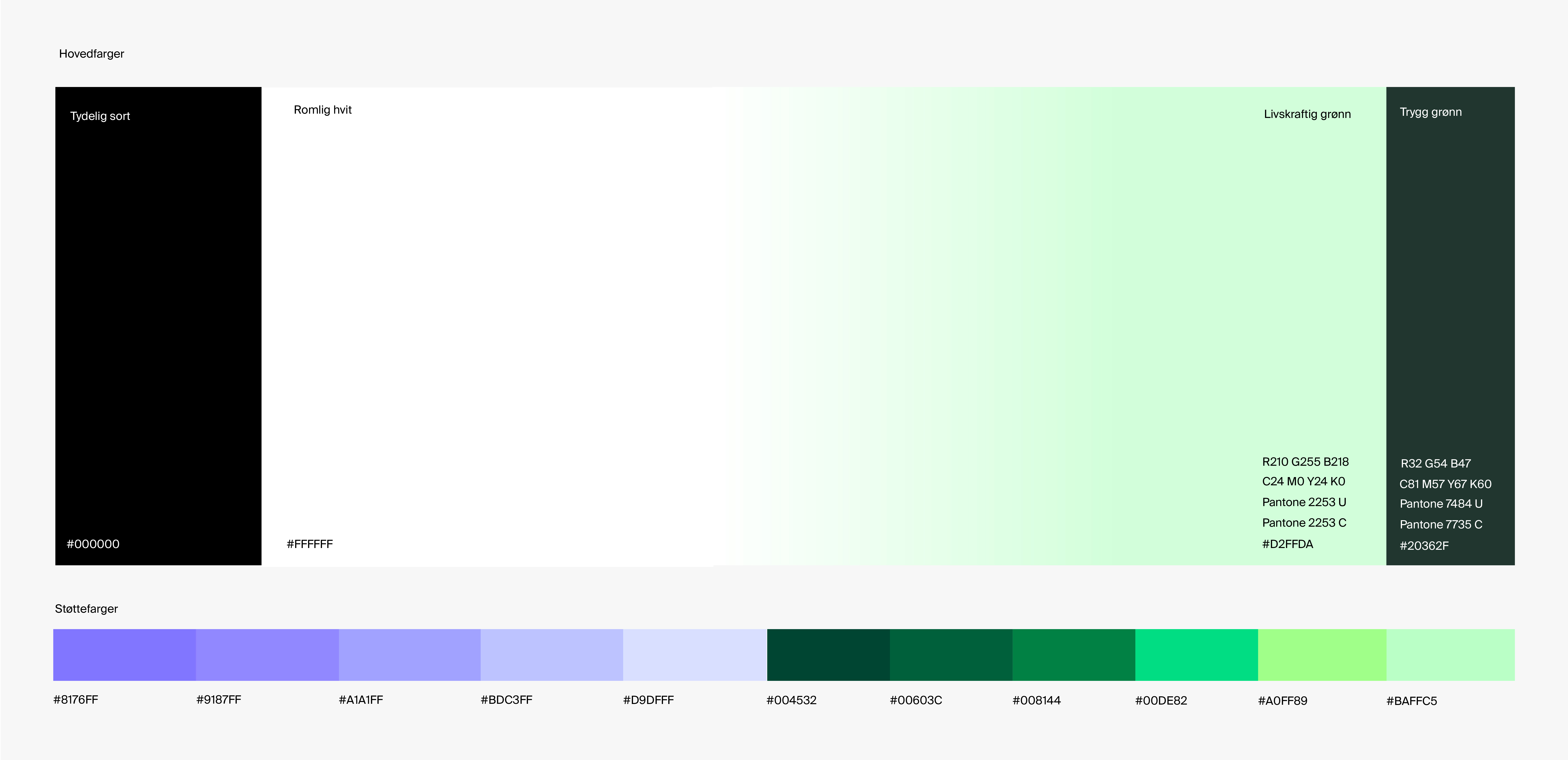
Primary colours
These colours symbolise the future through light green, and the past through black and white. The dark green shade represents security, stability and experience.
- Clear black should be used consistently in all text, with no exceptions for other colours, and black may not be used as a background colour across entire surfaces.
- Spacious white creates a sense of space around Allstad's design, and the identity prioritises “air” in the layout. White text is used only on a secure green background.
- Vital green is Allstad's central identity marker, second only to the logo. This colour can be used in a gradient from white to green (see visual element) or as a solid colour, but never for text.
- Secure green functions as a contrasting colour and contributes to a richer expression in the design when multiple elements or surfaces are present.
Download the colours in Adobe Swatch Exchange format
Visual element

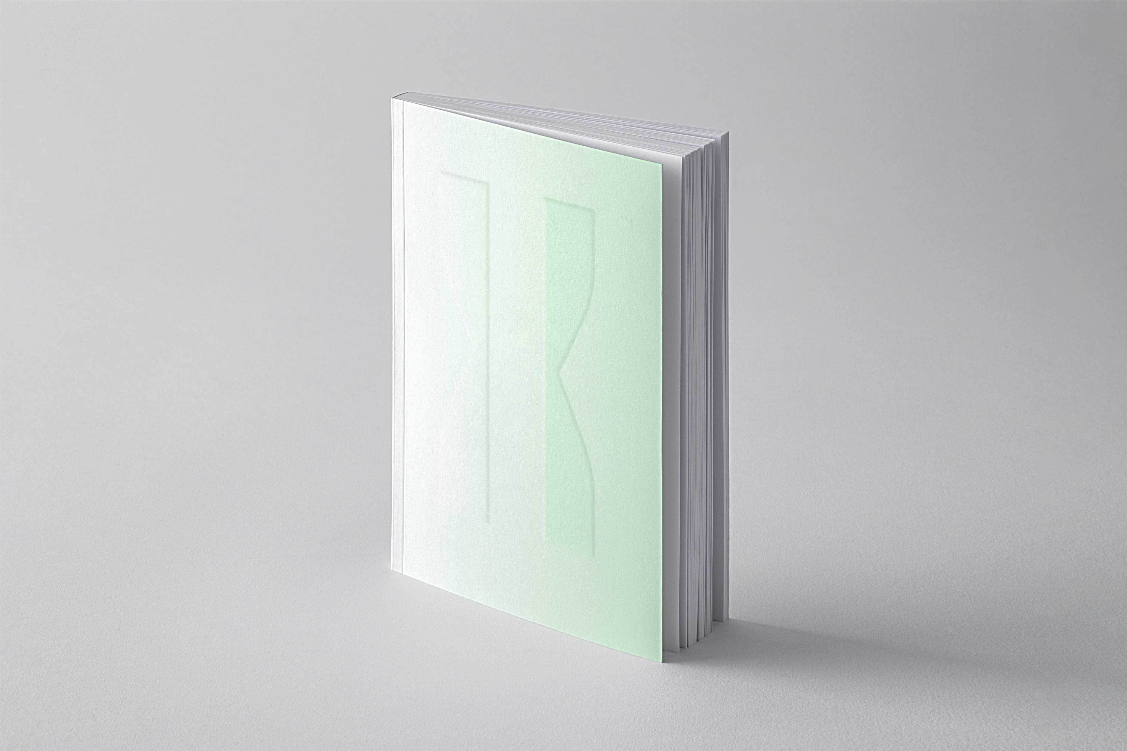
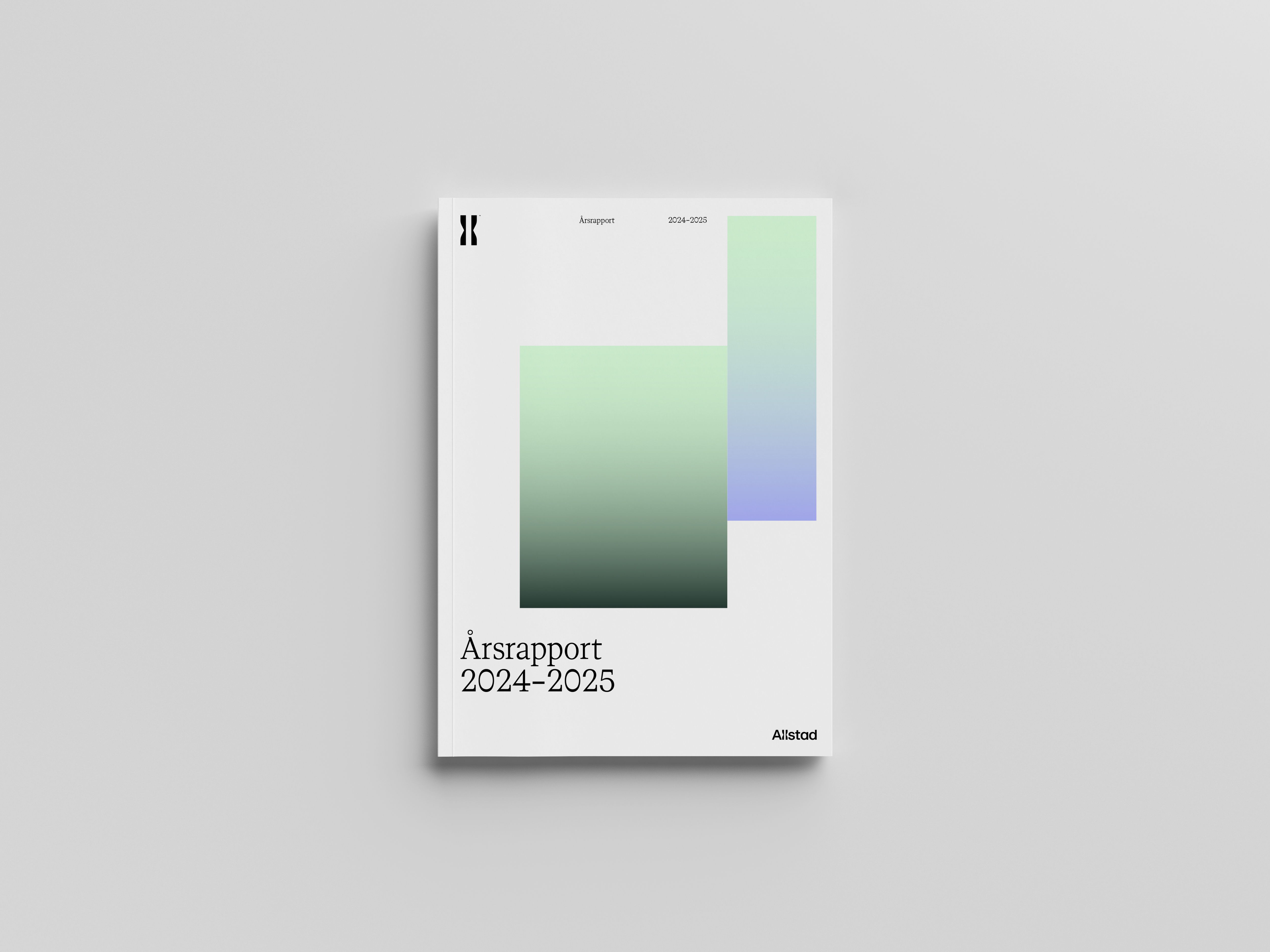
Allstad's additional element consists of a transition from vital green to white. This gradient is available for both static and animated applications, and can be used on websites, in PowerPoint presentations, social media and other digital surfaces. The gradients can be used as backgrounds for text and logos, or as standalone illustrations.
Layout
A consistent layout is a central component of Allstad's identity. This layout has been developed with specific grid and layout principles that provide clear guidelines for how templates should be designed, both on analogue and digital surfaces.
The grid system ensures a consistent structure that contributes to consistency and harmony in all visual communication. It provides a solid foundation for how elements such as text, images and graphics should be positioned, ensuring that all material is accessible and visually appealing.
The layout principles include guidelines for margins, spacing between elements and the hierarchical structure of content, all of which are essential for readability and navigation. This applies to both printed media such as brochures and magazines, as well as digital surfaces such as websites and presentations.
By following these guidelines, Allstad can maintain a recognisable and professional profile that strengthens the brand and provides a cohesive user experience across all platforms
Grid system
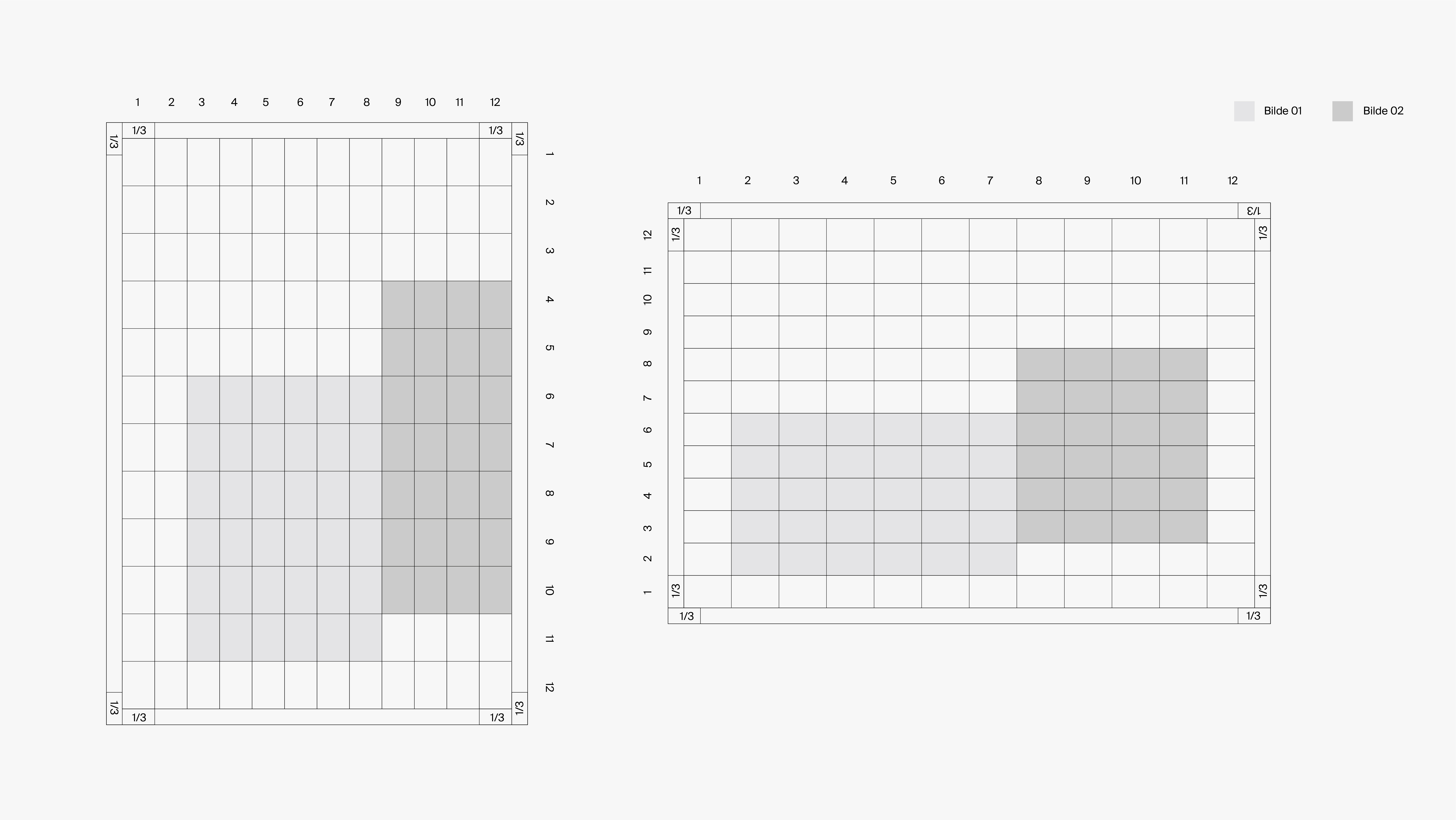
Allstad's grid system consists of a 12 x 12 layout, both vertically and horizontally. The margins are calculated based on the size of a grid cell and should be one third of the cell's longest side. Images can be placed anywhere within the grid, but it is important that they do not extend beyond the frame (for further details, see the layout principles).
Layout principle
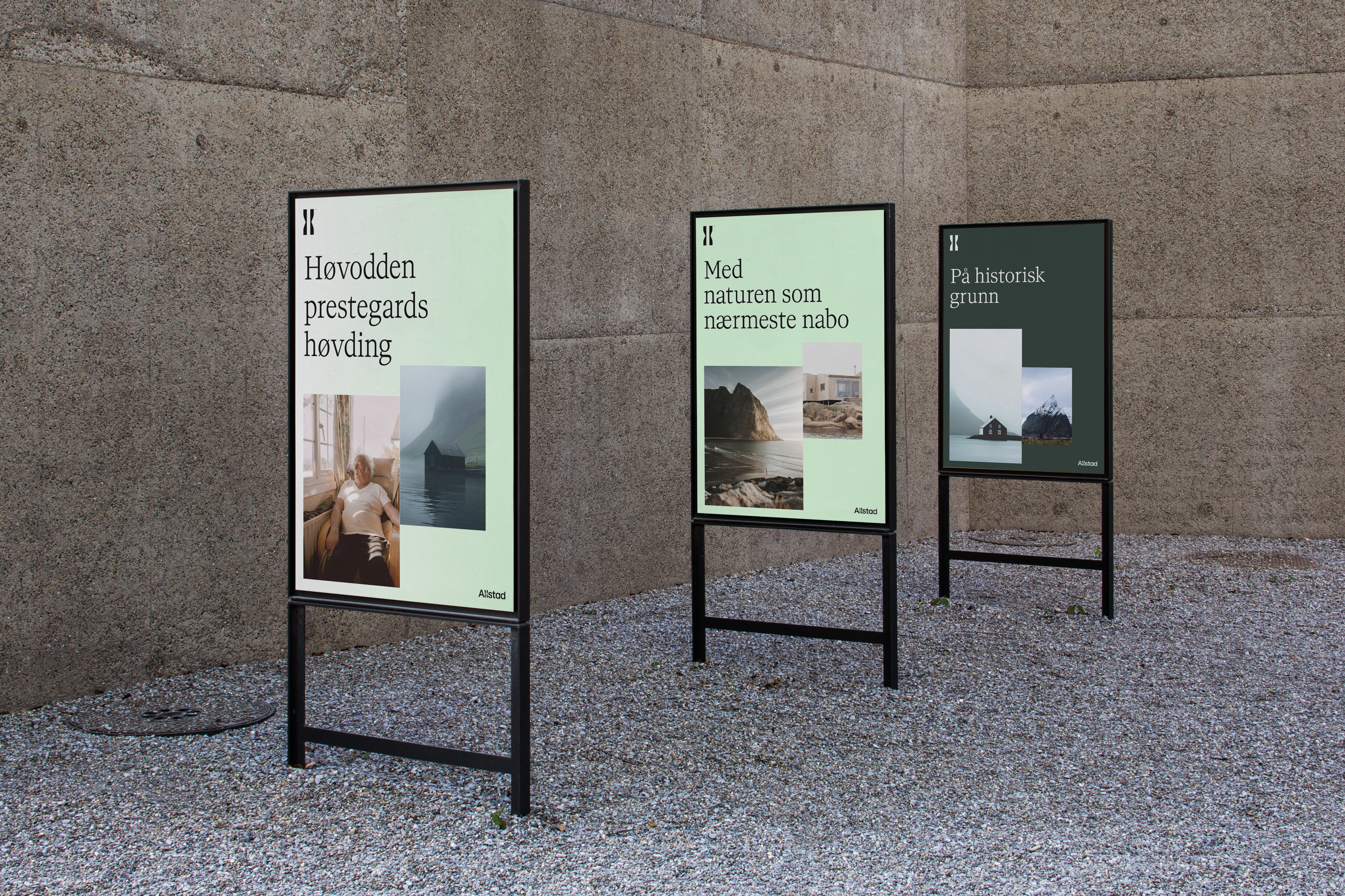
Allstad's layout principles are based on the concept of the meeting point, where two images always interact in the design. You are free to decide where the images meet within the grid, but they must never be the same size. Text should always be placed at the top or bottom left, and should never be placed on the right side of the format.
The two images that meet should have contrasting qualities; for example, they may show inside versus outside, old versus new, local versus national, or close-up versus distant. The purpose of the images is to convey a story about who Allstad is, or to highlight a specific theme.


Identity in use
To build a lasting and strong brand, it is essential that Allstad acts as a unified and consistent entity across all communication platforms. A unified identity helps create recognition and trust among our customers and partners. In this section, you will find a detailed overview of how our visual identity is to be implemented and used
Allstad's design programme was developed by Kurrpa Hosk.